


An end-to-end app design enhancing a furniture shopping experience
Heem is an iOS application for that aims to provide a better furniture shopping experience by helping customers shop products that match their styles and help them visualize furniture using AR technology — this is a conceptual project with the guidance of a mentor.
Role
UX Designer
Timeline
1 week
Skills
Figma, Adobe XD
The challenge
Furniture shopping requires higher financial and time investments which can be a dread in browsing and making purchase decisions. Shoppers often felt overwhelmed by the process and didn’t know where to begin. So how might we enhance the furniture shopping experience? How can we increase our sales by targeting online purchase showing AR features in our app.
My High level goals were to…
Design an iOS app that allows users to view a catalog of furniture.
Give more control over visualizing products.
Re-define the brand’s visual identity.
My approach
I started by market research and conducting user interviews. Then I created empathy maps using results from user interviews and competitor analysis. Being new to Augment reality I spent considerable time in designing user flows. After that I created wireframes, mood board and high fidelity interactive prototype using Figma.
Lastly, I led the usability testing and used insights to further iterations.
Outlining a research plan
“What do I know vs. what do I need to know"
Before diving into the research process, I outlined a plan with a list of research goals, assumptions, questions, and methodologies to set the direction of the research. This has guided me to think… what do I want to gain from each research method?
To start, I drafted 5 guiding research questions about the furniture shopping experience.
Who is the target audience?
How is augmented reality (AR) used in current shopping experiences?
What are the strengths and weaknesses of the competitors?
What motivates and concerns people when shopping furniture?
How do people find new furniture for their home using AR feature?
Understanding the market
I started with market research to gain a better sense of the furniture industry by gathering existing resources and information on demographics, market trends, and helpful statistics. Studying the market has guided me to understand the problem behind the problem by identifying the key findings.
Let’s talk about what I found out.

37% millennials purchase furniture online compared to 35% boomer and 28% Get X

38% of the most common source of inspiration comes from in-store displays

72% of the shoppers purchased items they had not planned to purchase because of AR
Key results of market research
Pay attention to millennial shoppers
Millennials are the age group that currently leads buying power — accounting for $600 billion in purchasing power, which becomes the biggest market furniture retailers can capture right now. Younger generations are more willing to buy items online because of the convenience, even if they can’t see and feel the products ahead of time.
Furniture shopping is shifting to online
Larger furniture pieces that are expensive and treated like investments, consumers still prefer to make their purchases in stores, where they can have the tactile experience of seeing and feeling a piece. But things are changing, as more commerce shifts online.
AR will become a common marketing tool
AR is a powerful tool for furniture retailers, because it lets shoppers visualize how large pieces of furniture will look in their homes before making a big purchase. Furniture is an incredibly visual industry, and customers welcome every effort to bridge the gap between the online and in-store shopping experiences
User Interviews
I conducted a series of user interviews to learn more about users needs, motivations, and frustrations in respect to shopping for furniture. I found four participants with extensive experience buying furniture on and offline. By asking open ended questions, I was able to gain a strong understanding of people's furniture buying behavior. I learned more about the pros and cons of online vs. offline furniture shopping. Moving forward, I created an empathy map in order to synthesize the results of my user interviews.
What I’ve learned
01. Key insight —
People want to have a better understanding of the product before making a purchase
Surprisingly, 100% of participants said they care about seeing the product in-person before purchasing new furniture. They mentioned that visualizing in-person is helpful to get a sense of the product.
Need: People need to see what the product actually looks likebecause of the convenience, even if they can’t see and feel the products ahead of time.
02. Key insight —
People find it helpful to gather creative ideas to enhance their home interior
I assumed this would apply to a lot of people, but surprisingly, 100% of participants said they spend time to get inspiration ideas for their home before purchasing new furniture. The most popular sources for gathering inspirations included Instagram and Pinterest.
Need: People need to find inspiration when selecting furniture for their home
03. Key insight —
People get frustrated when the product doesn’t match their expectations
86% of participants said they want to find more accurate product information to avoid getting disappointed with the actual item. They had negative experiences with the product images that are off, and challenges with the sizing.
Need: People need to find accurate product information
Competitor Analysis
Once I had a solid understanding of the furniture industry and Heem’s target market, I began researching competitors in the furniture space and created competitor analysis. I found that Heem has three direct competitors which all offer AR placement features. I identified strengths and weaknesses of each company. The goal was to keep strengths in mind and avoid weaknesses while designing the app.
User Persona
Based on primary and secondary research, I created a user persona that is reflective of Heem's target market. This user persona was used as a guide throughout the following design process. Kerry Williams served as a reminder of exactly who I was designing for.
Empathy Map
To further develop our persona more, an empathy map was created to document what Kerry is doing, thinking & feeling, seeing, hearing, along with the pains and gains that she faces. This map gives more dimension to Kerry, so that a deeper understanding of her goals, wants, and needs can be formed to guide the design phase.
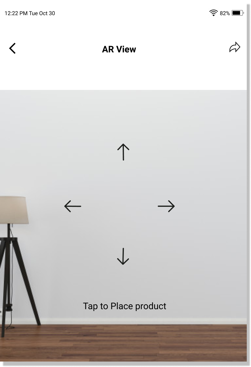
User flow
Since augmented reality is a relatively new technology, I wanted to understand how users would interact with this feature. I created a user flow demonstrating how a user could place an item via AR. I based this user flow off of the below scenario.
Scenario: Kerry found a product that she wants to buy now she wants to see the item in her room using AR view.
Building mid-fi wireframes
Now that I’ve generated some sketches, it’s time to digitize and get blueprints ready for my visual interface. I developed mid-fi wireframes to visualize hierarchy, priority, and flow before implementing more details like font and colors. With these wireframes, I created a mid-fi prototype using Figma to give users a functional prototype to interact with during usability testing.


Testing the wireframes
The testing stage is where the solution gets tested by users in their real life setting. The goal of this phase is to identify areas for improvements, uncover misunderstanding, and validate or invalidate assumptions. How well does my design translate to users?
I outlined my plan and goals for the testing before conducting usability testing. I decided to conduct a remote moderated “think aloud” test via Zoom.
I recruited 4 Gen Zers and Millennials, who have purchased or planning to purchase furniture. Gladly, I was able to get a 100% test completion rate as well as 95% error free rate.
Listen,observe and improve
By observing the participants during the usability testing, I was able to collect enough data. I gathered all my notes and recordings to synthesize these findings using an affinity map. Like how I did with the empathy map, I started grouping similar “stickies” together in order to extract insights. Based on this exercise, I uncovered key insights and recommendations for further iterations to ensure my design is human-centered.
Branding
Now that the “blueprints” are ready, it’s time to work on the brand identity and add a little life to the interface. To create a mood board for Heem I turned to Pinterest. My goal was for Heem to fit the brand attributes of minimalist, upscale, Scandinavian, trendy and professional. I found pins for typography, color palette, logos and images that met those brand attributes.

To ensure the cohesive look and feel of the app, I then developed a style tile guide which serves as a synthesizing document that showcases the type choices, color palette and visual imagery. I followed the brand attributes on fonts pairing and colors to ensure that it’s aesthetically reflecting the brand identity.
Building high-fi wireframes
Once I decided on a visual layout direction, I then created high-fidelity wireframes in Figma that are complete with all stylings of UI elements used across high-fidelity mockups so that all screens have a cohesive look throughout. I also put together a wireframe user flow to help me demonstrate the app hierarchy.


My learnings
This project helped me learn lot of concepts about AR. I learned how to keep consistency between different pages of a website in order to build the whole visual. Practicing my responsive design skills provided me a deeper insight on how to display content. As an AR newbie, I was able to research and explore new techniques and capabilities with regards to mobile devices. This has also made me want to learn more about AR and its technical considerations.